

A lot of photographers think of their contact page as just a form.
Name. Email. Message. Done.
But honestly, your contact page influences far more than just enquiries.
It affects user experience, website flow, and even how people engage with your website overall.
Because by the time someone reaches your contact page, they are usually already interested.
They are deciding whether taking the next step feels easy, clear, and aligned with the kind of experience they want.
And this is exactly where many photography websites accidentally create friction.
One thing I have learned through both website design and SEO is that clarity matters more than complexity.
Especially in the wedding industry where people make emotional decisions, not just practical ones.
If you want to continue improving your photography website beyond just your contact page, I have also written guides on:
what should be on a wedding photographer’s homepage for better SEO
how to design a pricing page that attracts the right clients
10 must-have features on a wedding photographer’s website.
Table of Contents
1. Why contact pages matter for SEO
2. Too many form fields create friction
3. There is no single “correct” contact form
4. Why I moved my contact form to my homepage
5. Why multiple contact options matter
6. Common contact page mistakes photographers make
7. Contact pages and user experience signals
8. Final thoughts
1. Why contact pages matter for SEO
SEO is not just about getting traffic.
It is also about helping users move naturally through your website once they arrive.
Your contact page plays a major role in that journey because it is often the final step before an enquiry.
If the process feels frustrating or unclear, people leave.
And when enough users leave quickly or stop engaging with a website, those behavioural signals can indirectly impact SEO performance over time.
This is why conversion strategy and SEO often overlap more than people realise.
Especially for photographers where trust and emotional connection matter heavily throughout the booking journey.
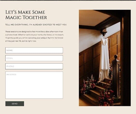
2. Too many form fields create friction
One of the biggest mistakes I see is contact forms trying to collect too much information too early.
Huge questionnaires, complicated dropdowns, mandatory fields for every possible detail.
Sometimes photographers unintentionally turn the contact form into a full client onboarding process before someone has even sent the first enquiry.
And honestly, that can feel overwhelming.
Especially for couples who are probably contacting multiple vendors while planning a wedding.
Simplicity usually performs better.
Not because users are lazy, but because clarity reduces hesitation.
This idea of reducing friction is something that applies across websites generally, not just contact forms. It also connects closely to how users move through content and decision making online, which I talk about in SEO vs Instagram for wedding photographers.
3. There is no single “correct” contact form
One thing I always tell photographers is that there is no universal perfect contact form.
It depends entirely on your audience, your process, and how you work.
A luxury photographer booking high-end destination weddings may need more qualifying questions upfront.
Another photographer might prioritise simplicity and conversation first.
Neither approach is automatically wrong.
The important thing is that the form reflects the experience your audience actually needs.
That is why strategy matters more than copying what everyone else is doing.
4. Why I moved my contact form to my homepage
Personally, I decided to move my own contact form to the bottom of my homepage rather than relying entirely on a separate contact page.
For me, it felt more natural from a user experience perspective.
By the time someone reaches the bottom of the homepage, they have already taken in the messaging, portfolio, positioning, and overall feel of the brand.
At that point, the next clear step is naturally reaching out.
So instead of forcing another click, I wanted the transition into contacting me to feel seamless.
At the same time, I still keep clear navigation because some people prefer directly going to a contact page first.
There is no single perfect user journey.
Different people browse websites differently.
5. Why multiple contact options matter
Another thing I intentionally simplified was reducing the pressure around the enquiry process itself.
I keep my form relatively simple while also offering alternative ways to contact me.
Some people prefer email.
Some feel more comfortable sending a quick Instagram message.
Others prefer calls.
Giving multiple options creates flexibility and makes the process feel more approachable.
Especially in creative industries where communication styles vary so much.
And honestly, the easier you make it for someone to contact you, the more naturally your website supports the journey from visibility to enquiry, which is one of the reasons I still believe strong content and structure matter so much long term which i discuss further in why blogging still matters for wedding photographers in 2026.
6. Common contact page mistakes photographers make
Some of the most common issues I see include:
- too many required fields
- unclear next steps after submission
- no response expectations
- forms hidden deep within navigation
- no mobile optimisation
- slow loading pages
And sometimes the issue is not even the form itself.
Sometimes the messaging leading into the form creates uncertainty.
If users are unclear about pricing, process, availability, or experience before reaching the contact section, hesitation naturally increases.
7. Contact pages and user experience signals
Modern SEO is deeply connected to user experience.
Google wants to rank websites that feel genuinely useful, easy to navigate, and aligned with what users are looking for.
That means things like:
- clear navigation
- mobile usability
- page speed
- structured content
- easy next steps
All of these influence how people interact with your website.
And honestly, this is why SEO can no longer be separated from design strategy.
Beautiful visuals alone are not enough if users feel confused about what to do next.
8. Final thoughts
Your contact page should not feel like an obstacle.
It should feel like a natural continuation of the experience your website has already created.
There is no perfect formula.
But when your website feels clear, approachable, and aligned with how your audience actually behaves, enquiries become far more natural.
Because good SEO is not just about getting found.
It is also about helping the right people feel comfortable enough to reach out once they do.

