

Your logo isn’t just a pretty graphic it’s the visual shorthand for your brand’s entire personality. But here’s the thing: one single logo file won’t cut it if you want a polished, versatile, and luxury-level brand presence. If you’re a photographer, wedding planner, or creative service provider, you need a set of logo variations that adapt seamlessly across every touchpoint, your website, social media, business cards, packaging, and more. Let’s dive into the four logo variations your brand absolutely needs (and why they matter for making your business unforgettable).
Why Multiple Logo Variations Matter for Your Brand
When you think of iconic brands, Chanel, Tiffany & Co., Louis Vuitton, they don’t just have one version of their logo. They have a toolkit of carefully designed variations that maintain brand recognition across every platform. As a service provider or creative business owner, your brand needs that same flexibility.
Here’s why:
- Consistency builds trust: Clients feel more confident when your branding is polished and cohesive everywhere they see it.
- Adaptability: Different platforms, screen sizes, and formats require different logo styles for optimal visibility.
- Professionalism: A single stretched or pixelated logo can instantly make your brand look amateur.
By investing in multiple logo variations, you ensure that your brand always looks intentional, elegant, and ready to serve your ideal clients, whether they’re browsing your website, scrolling Instagram, or opening your beautifully designed welcome guide.
The 4 Essential Logo Variations Every Brand Needs
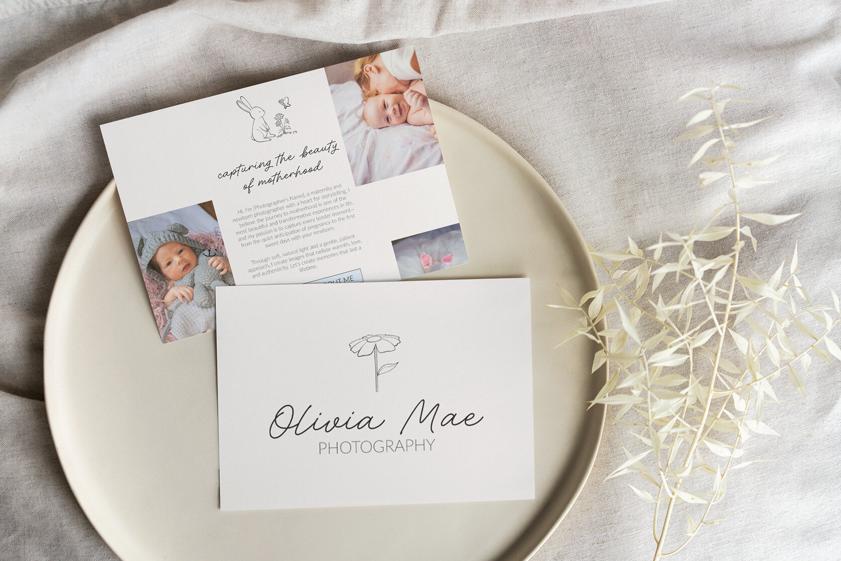
1. Primary Logo
This is your main brand mark, the full, detailed version of your logo that includes your business name and any key brand elements. It’s the one that likely comes to mind when you think “my logo,” and it’s used most often for high visibility applications.
- Best for: Your website header, business cards, stationery, signage, and major print materials.
- Design tips: Make sure it’s legible at various sizes and reflects your brand personality. For photographers or wedding pros, consider timeless typography and minimal ornamentation for a luxury feel.
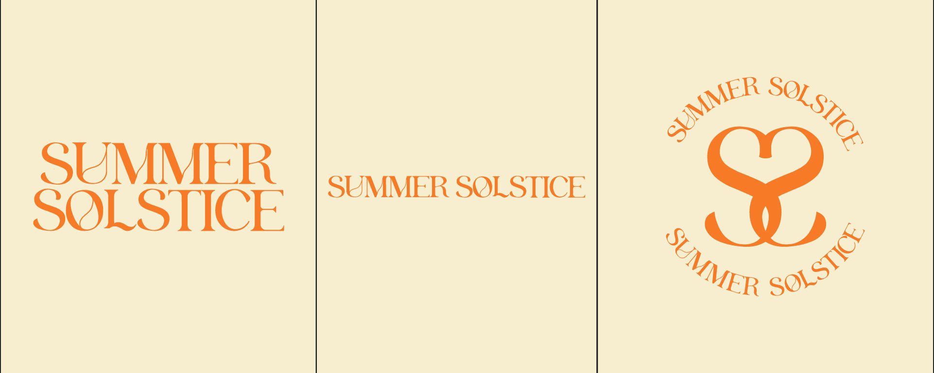
2. Secondary Logo
Your secondary logo is a simplified variation of your primary logo. It might rearrange elements into a different layout, horizontal instead of stacked, or without a tagline, to better fit certain spaces.
- Best for: Social media banners, marketing materials with limited space, smaller website placements, and branded documents.
- Design tips: Keep the core design elements intact so it still feels unmistakably like your brand.
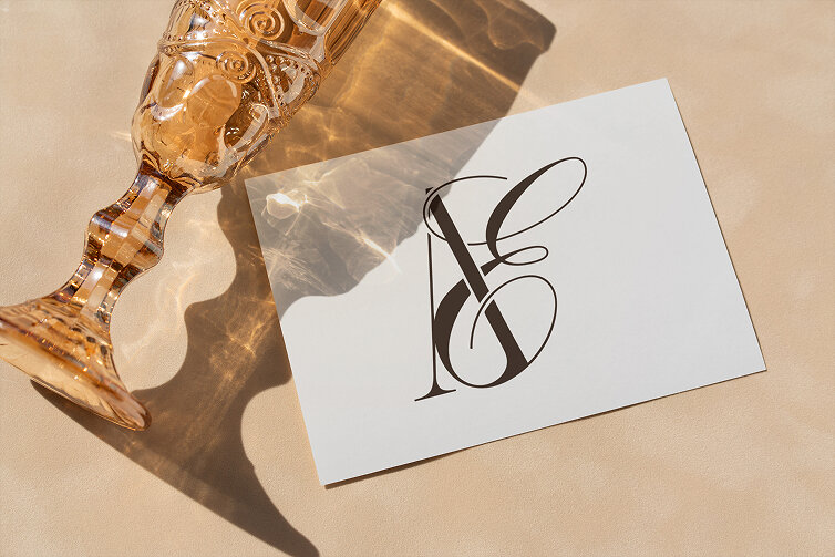
3. Submark (or Brand Mark)
A submark is a minimal, icon like version of your logo, often just initials, a monogram, or a symbolic graphic. It’s your brand’s shorthand and works beautifully in small spaces.
- Best for: Instagram profile pictures, watermarks, social media posts, stickers, and subtle packaging details.
- Design tips: Make sure it’s clear and recognizable even when used at very small sizes.
4. Favicon
A favicon is the tiny icon that appears in the browser tab when someone visits your site. It’s easy to overlook, but it’s another opportunity to make your brand feel complete and professional.
- Best for: Your website, this is what shows up in browser tabs, bookmarks, and search results.
- Design tips: Use a very simplified version of your logo (often just a single letter or shape) so it’s clear at small sizes.
How These Variations Work Together
Think of these variations as a wardrobe for your brand. Just like you wouldn’t wear the same outfit to a casual coffee date and a black tie event, your logo should be able to “dress” appropriately for each platform or situation, while still feeling like you.
When used strategically, your logo variations:
- Reinforce brand recognition no matter where your audience encounters you.
- Make your brand look high end and intentional.
- Ensure your visuals never feel awkwardly cropped, stretched, or mismatched.
SEO Benefits of Using the Right Logo Variations
While logo design itself isn’t a direct ranking factor for search engines, how you use your logos across your online presence impacts your SEO. Here’s how:
- Optimized alt text: Every time you upload your logo, use keyword rich alt text like “Luxury wedding photographer logo, [Your Business Name]” to help with brand searches.
- Faster site speed: Properly sized logo files prevent your site from loading slowly, something Google considers in rankings.
- Consistent branding: Recognizable visuals make users more likely to stay on your site longer, reducing bounce rates.
Common Mistakes to Avoid
- Using your primary logo everywhere, even where it’s too detailed or small to read.
- Not having transparent background versions of your logos.
- Forgetting to export your logos in multiple file types (PNG for web, SVG for scalability, JPG for certain print uses).
- Ignoring your favicon, small details make a big difference in luxury branding.
Final Thoughts: Your Logo Is a System, Not a Single File
If you’ve been relying on one logo for every possible scenario, it’s time to upgrade your brand toolkit. These four variations will give you the flexibility, polish, and professionalism your business deserves.
And if you’re ready to elevate your brand visuals, I can help you not only design a logo suite but also create a website that works seamlessly with your brand identity. Because your logo is just the start, your entire online presence should feel just as intentional and beautiful.
Let’s design a brand that’s unforgettable.
Click here to start your brand design journey today.
Thanks for reading!
Kami x