

Learn how to design a pricing page that converts browsers into booked clients. This guide blends UX best practices with business psychology to help creative professionals, especially wedding photographers, communicate value and attract the right audience.
If you want to dive deeper into optimizing your photography website, I’ve written guides on other key pages and features that can help boost your SEO and attract the right clients:
What Should Be on a Wedding Photographer’s Homepage for Better SEO?
Why Your Contact Page Is Hurting Your SEO (And How to Fix It)
10 Must-Have Features on a Wedding Photographer’s Website
How to Design a Pricing Page That Attracts the Right Clients
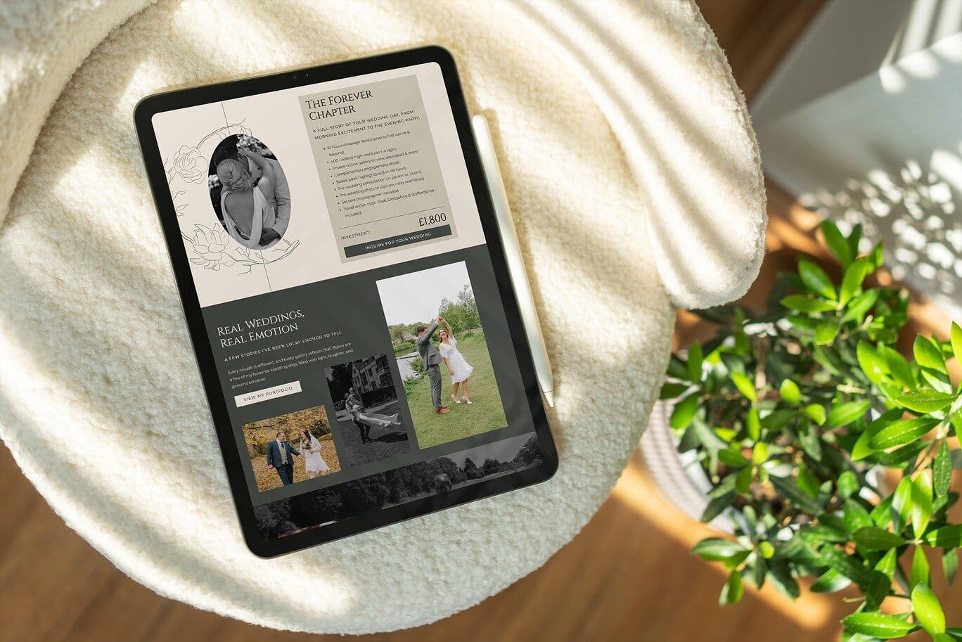
Your pricing page is one of the most powerful conversion tools on your website. When designed strategically, it does more than share numbers. It positions your brand, builds trust, and helps attract clients who value your work. Whether you are a photographer, designer, or creative business owner, a well-structured pricing page blends UX clarity with business psychology.

Start with Value Before Price
When visitors land on your pricing page, they want clarity and reassurance. Instead of listing packages immediately, start by reinforcing the value of what you offer. Explain what sets your process apart, show testimonials, or briefly outline your client experience before sharing prices.
This primes the viewer to perceive your pricing as part of a complete, valuable service rather than a simple transaction. Learn more about pricing psychology at Psychology Today The Psychology of Pricing.
Make It Easy to Understand
Good UX design is about clarity. Visitors should be able to scan your pricing page and understand their options within seconds. Use clear headings, bullet points, and consistent layouts. Avoid overwhelming your clients with too many packages or lengthy explanations.
Research shows that cognitive simplicity increases conversion rates. You can read more about this principle in Nielsen Norman Group Minimalist Web Design.
Use Anchoring to Frame Perceived Value
Anchoring is a key psychological concept in pricing strategy. When you show multiple packages, the first one a visitor sees influences how they perceive all others. Start with a premium or mid-tier package that reflects your ideal client. This sets a mental benchmark and helps others feel more accessible without devaluing your brand.
Learn more about the anchoring effect from Verywell Mind What Is the Anchoring Bias.
Include Social Proof
Couples often feel uncertain before reaching out. Including testimonials, reviews, or featured publications on your pricing page reinforces trust and signals professionalism. Place a short testimonial near or under each pricing option, ideally highlighting results or emotions like ease, trust, or joy.
According to Invesp, 88% of consumers trust user reviews as much as personal recommendations.
Guide Visitors with a Clear Call to Action
Your pricing page should always lead to the next step. After presenting your packages, end with a simple, inviting CTA such as “Check My Availability” or “Let’s Talk About Your Wedding.” The goal is to reduce friction and encourage immediate engagement.
Make sure your button stands out visually. Keep text short and positive. For more insights on CTA psychology, visit OptiMonk Call to Action Examples.
Bonus UX Tips for a Polished Pricing Page
- Use soft contrast backgrounds to separate sections and make reading easy
- Add subtle hover effects for interactive clarity
- Ensure pricing information is easy to find on mobile devices
- Include your contact link or form directly below pricing
Final Thoughts
A strong pricing page is not just about numbers. It’s about communicating confidence, clarity, and professionalism. By combining thoughtful UX with proven pricing psychology, you help your visitors understand your value, feel reassured, and take action confidently.
Thanks for reading!
Kami x

